Winter Milk: Ice Cream Never Looked So Good!
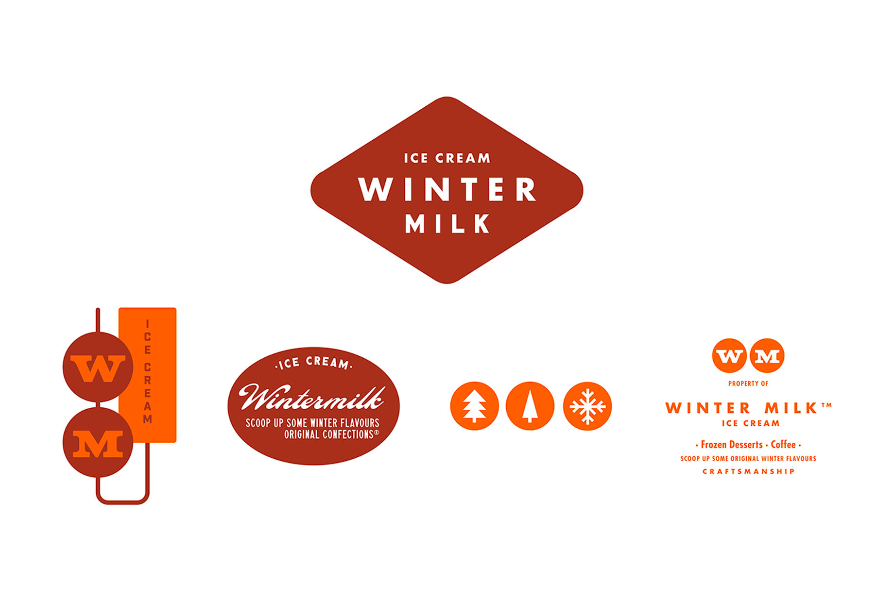
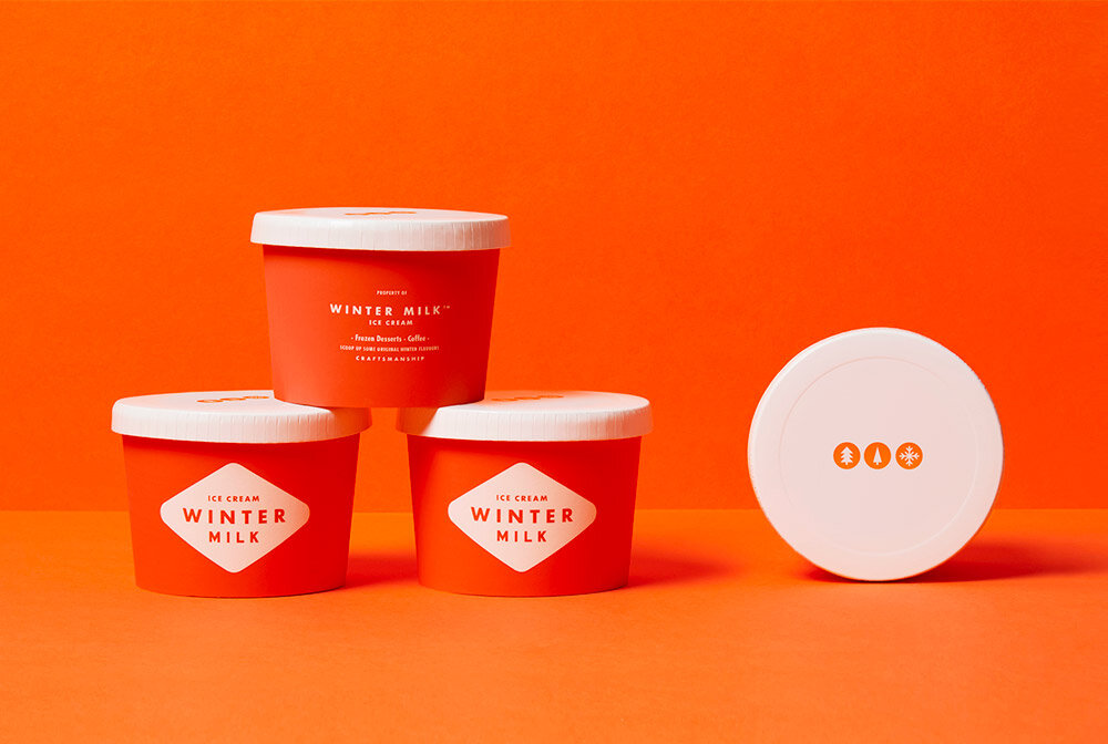
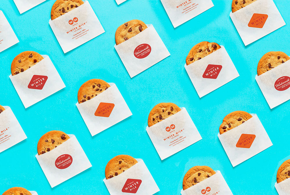
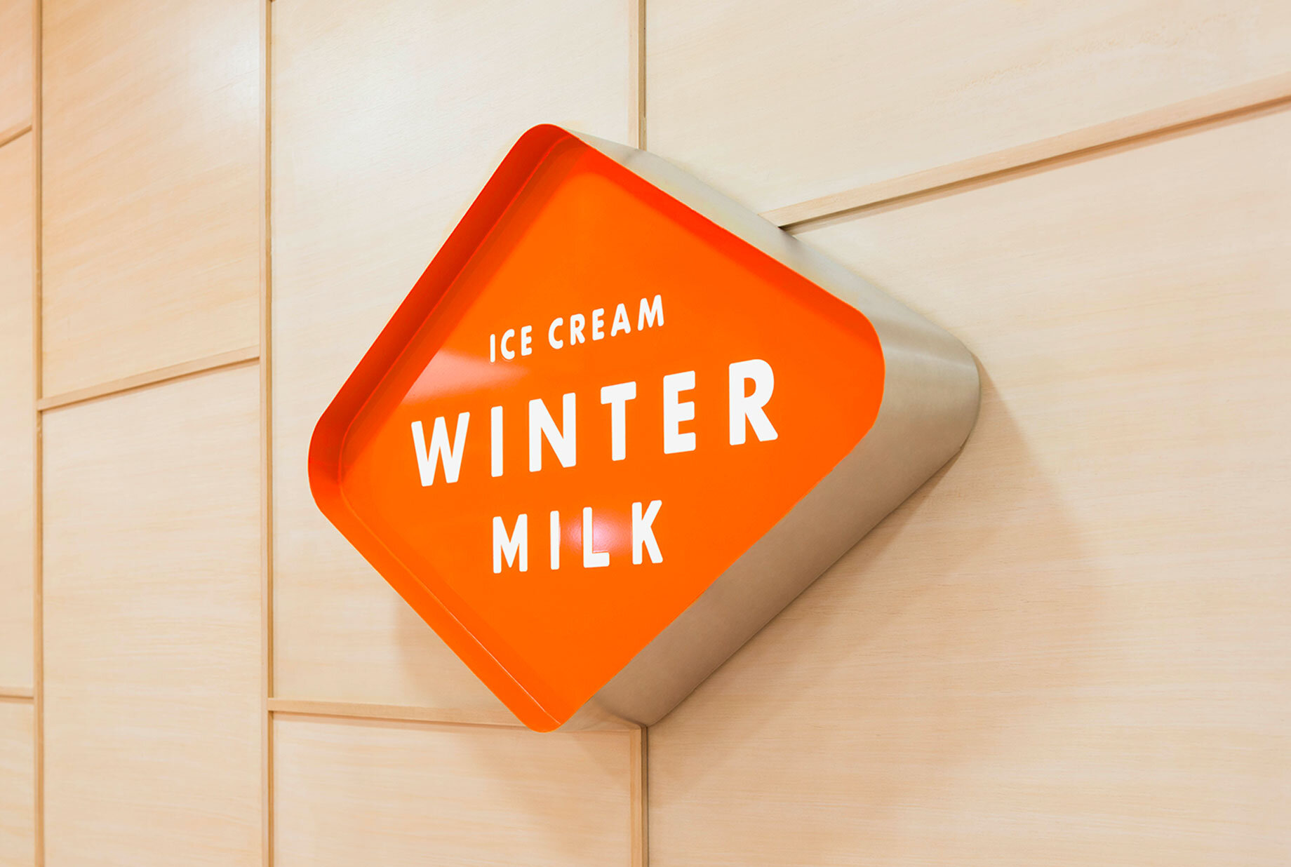
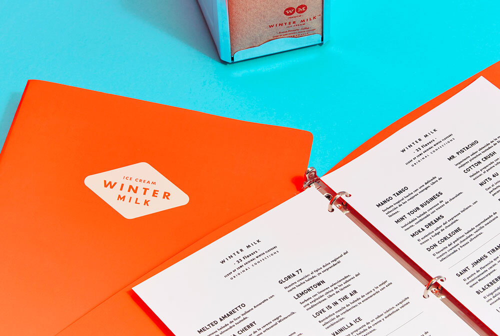
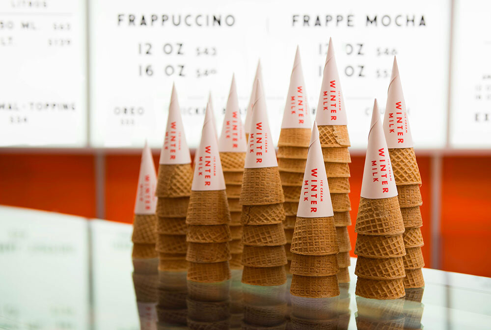
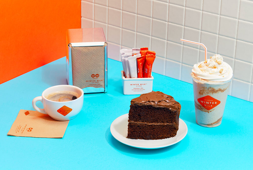
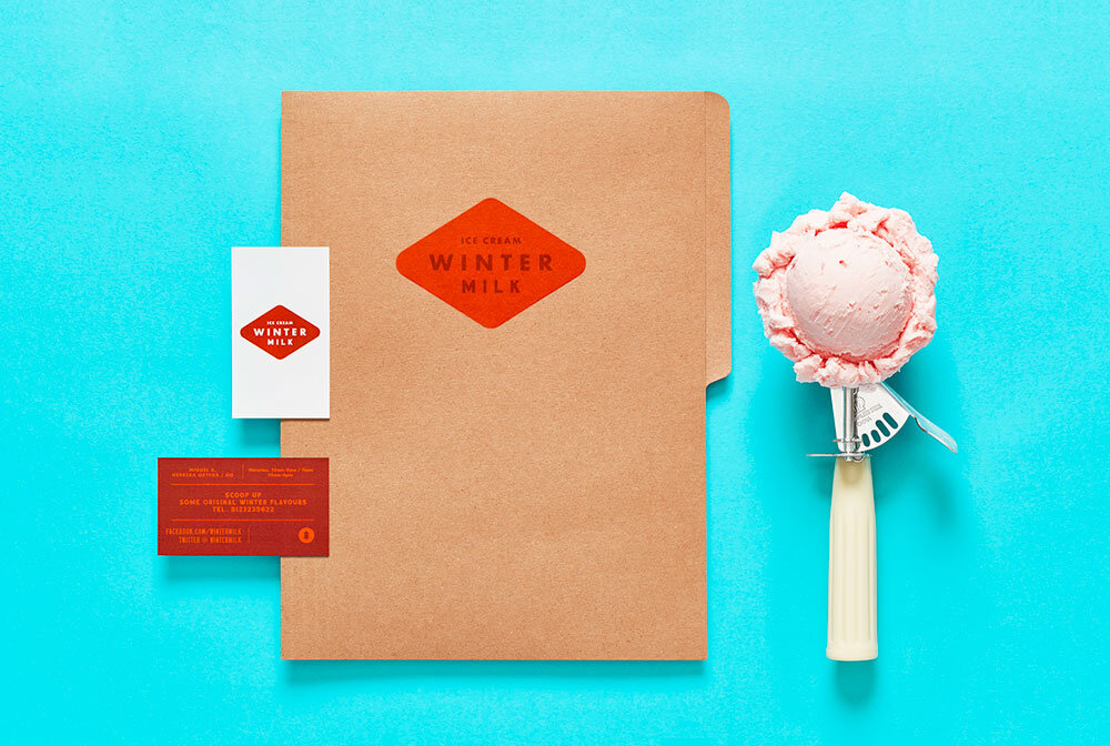
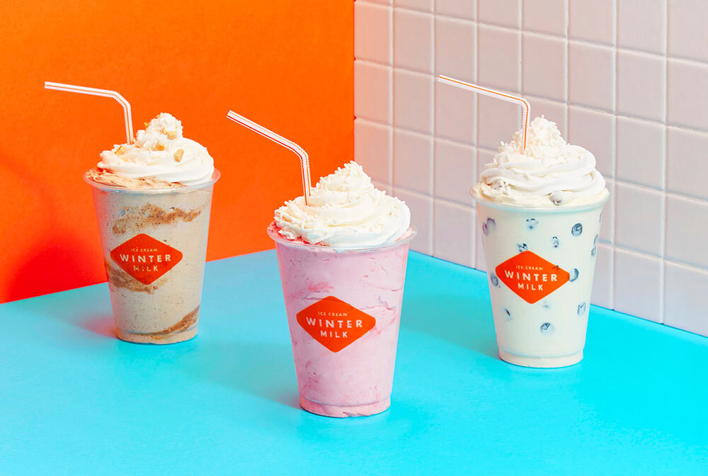
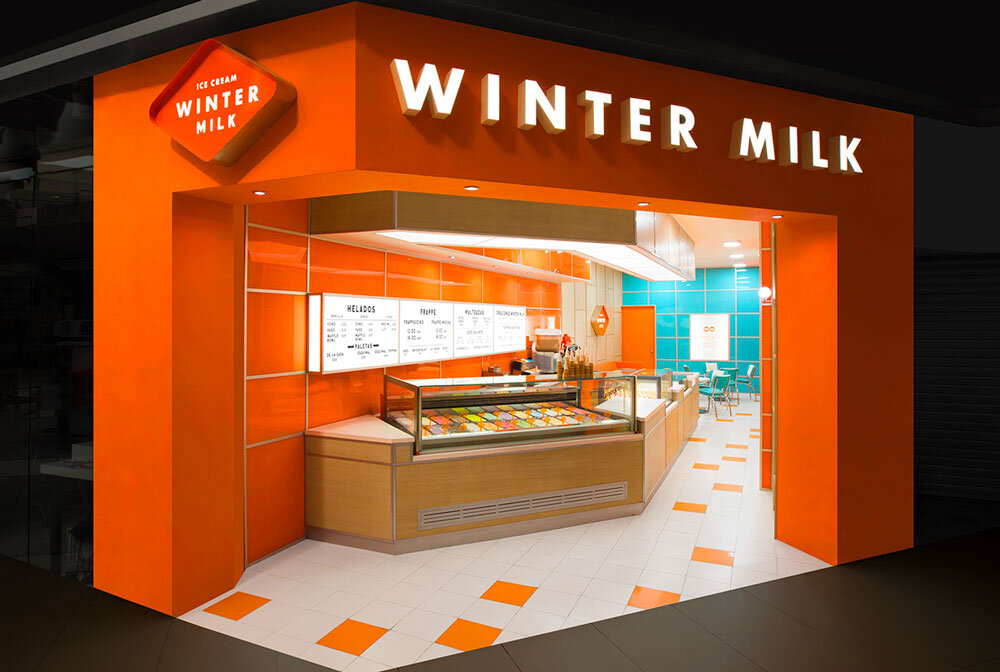
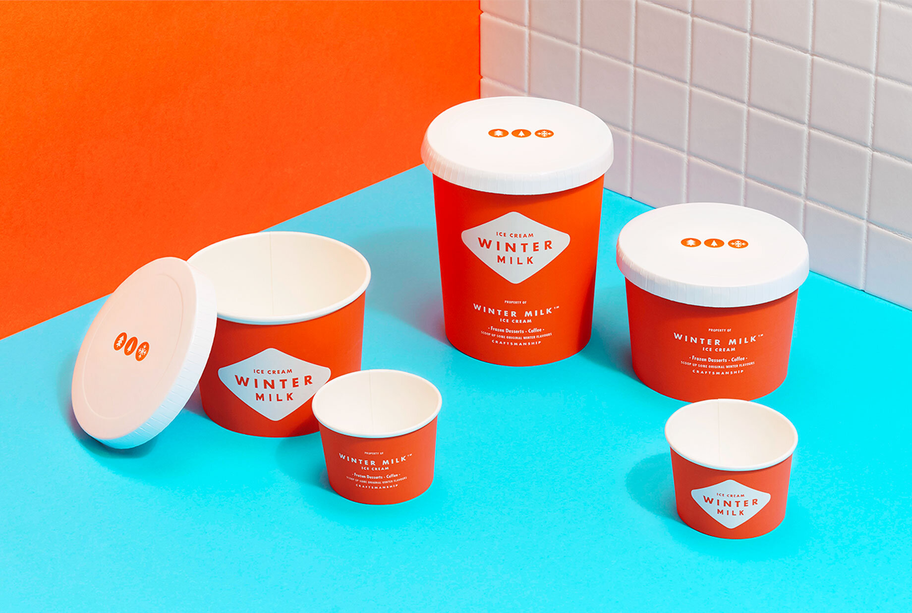
Winter Milk is a Mexican ice cream company with 16 locations and a variety of fresh lactose based products - milkshakes, frappes, ice cream… All made with 100% natural ingredients. Back in 2017, Anagram designed a fresh and truly mesmerizing brand identity for the brand and, I’m not gonna lie, I often come back to it just to look at it (my graphic designer’s heart speak, I follow it). It’s not often that a brand allows itself to own their identity like that. The colors are bold and fresh at the same time. There’s a clear 60s/70s vibe that is only overshadowed by how modern it feels. The ratio between the simplicity of the typography and layout counter-balanced by the bold choice of colours, makes for a unique visual identity.
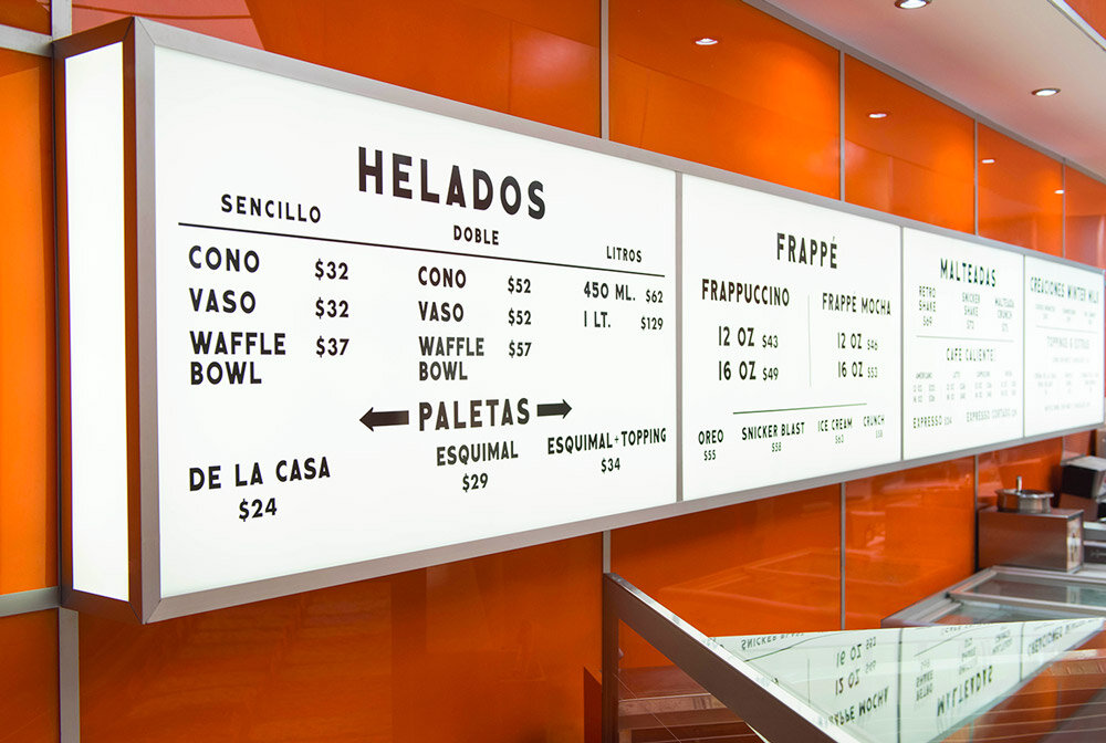
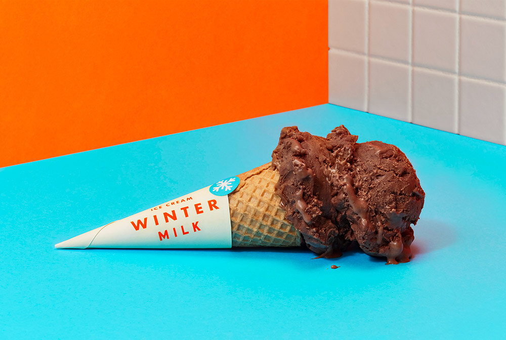
Inspired by the cinematic and quirky world of Wes Anderson, the packaging and interior feel like you're in a movie and some great events are bound to happen if you ever set foot in one of their shops. It also evokes great memories of eating ice-cream with your family as a kid. it's like they took all the positive feelings about nostalgia and fashioned them into one of the best brand design work I have seen in the past few years. I can only applaud 👏 👏👏
Photos by Anagram

